BRANDING
RED BACK
I’MPOSSIBLE
COCA COLA
RED BACK, AUSTRALIAN WHEAT BEER
Stiff upper irreverence is the hallmark of British advertising. And by breaking all the rules of corporate braggadocio, practicing the rarified art of the self-teasing theme line, Brit ads connect with people instantly through self-effacement. This introduction of RedBack beer, an Australian lager, is a pretty good example of that. A campaign in which the images function as a metaphor for the name. Like a riddle, they give you a clue but don't give it entirely away. "REDBACK. It's a beer I think". .
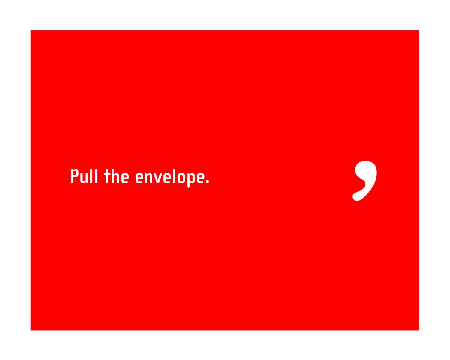
ONE TINY PUNCTUATION MARK DIFFERENTIATES MARKEDLY.
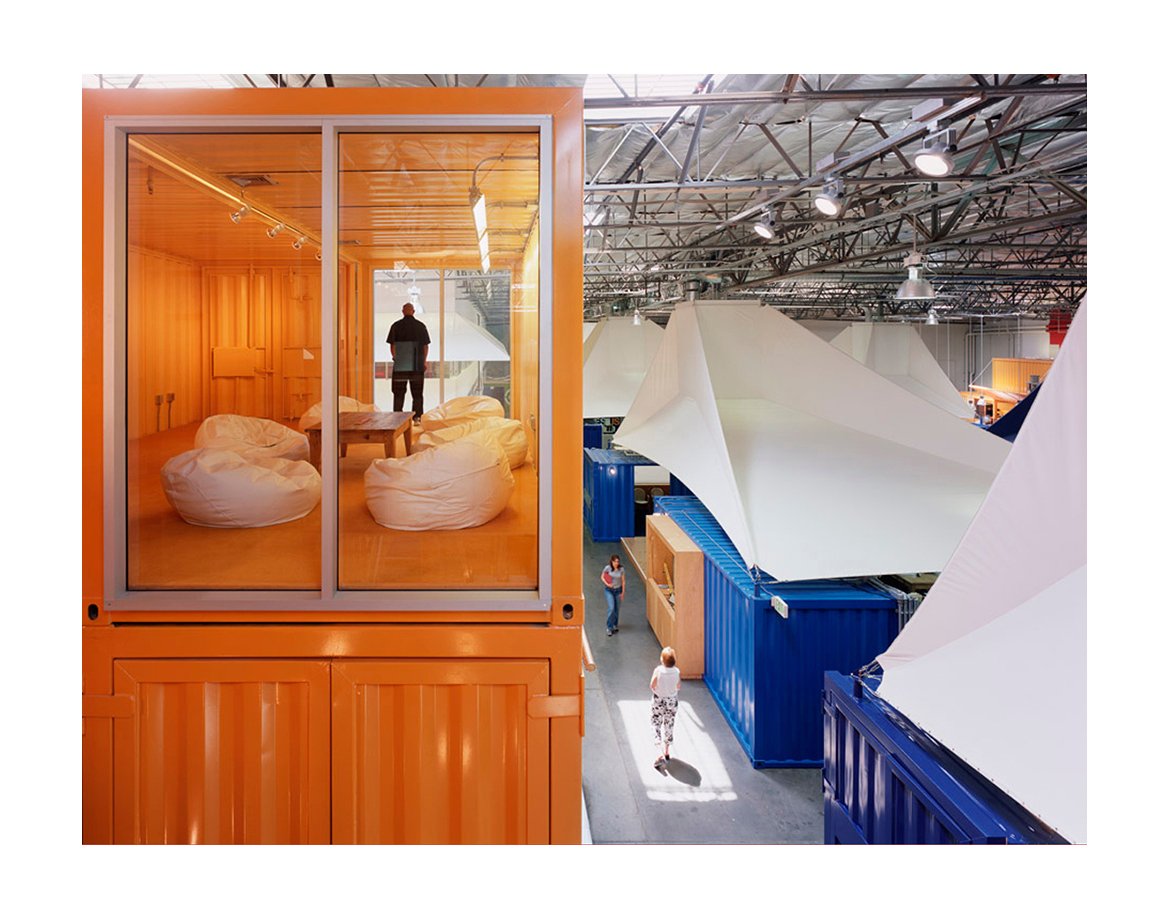
In this case, that little bit of ink takes a word expressing futility, and turns it into a name for an advertising agency differentiated by a population of very stubborn believers, whose core belief is that nothing is impossible. And that what they do every day can help make the world a better place. The apostrophe was the differentiator. So, we made it the trademark. And made "I'mpossible" the name.
CORPORATE IDENTITY: Name/ logo

CORPORATE IDENTITY: Business cards


